
The Equity Gilt Study from Barclays is an annual publication containing extensive data on UK equity, bond and cash returns since 1900. In this research note, we look at how the returns in 2015 compare with previous years.
View / Save / Print PDF (14 pages)
We also examine the overall trends in historical equity and gilt returns, and determine what £100 invested in 1900 would be worth now if invested in either of these asset classes. Finally we examine the volatility and risk-adjusted returns of equities, gilts and a portfolio containing an equal allocation to both.
Summary
2015 was a poor year in the UK for both equities and gilts. On a nominal basis, the two asset classes returned +1.2% and -0.5% respectively. Out of the last 116 years, 2015 was the 83rd best year for equities and the 86th best year for gilts.
£100 invested in equities at the end of 1899 would now be worth £2.23 million on a nominal basis and £28,226 on a real (inflation-adjusted) basis. Similarly £100 invested in gilts would be worth £36,458 on a nominal basis and just £454 on a real basis. Due to very low interest rates over the last few years, the real value of cash has been declining since 2009.
The volatility of annual equity nominal returns is almost double that of gilts. However on a real basis it is only 50% higher. When looking at rolling annualized returns over longer periods, the volatility of real equity returns starts to decline, and after eleven years it is lower than the volatility of gilt returns. This means that when investing over a long time horizon, it is theoretically less risky to place your money with equities.
The Barclays Equity Gilt Study
The Barclays Equity Gilt Study (‘the Study’) has been published annually since 1956. Now in its 61st edition, it provides extensive data and analysis on long-term asset returns in the UK and the US. The UK data goes as far back as 1899 and we use it to examine trends in equities, gilts, interest rates and inflation.
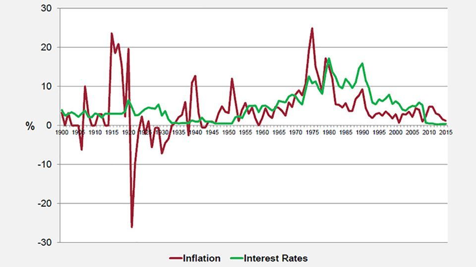
Inflation and interest rates
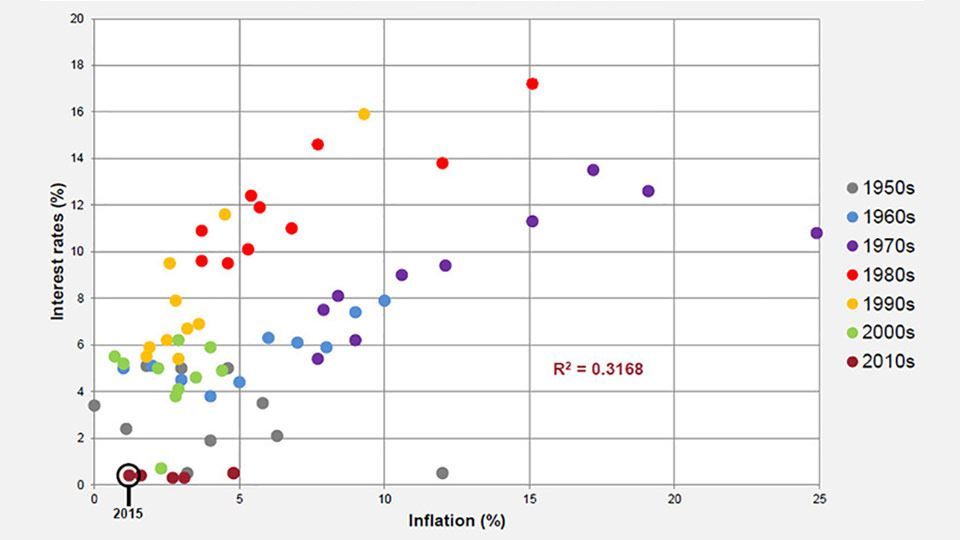
Interest rates are measured using a UK Treasury Bill index and inflation is measured by a cost-of-living index which is computed using Bank of England data up to 1914 and then the Retail Price Index (RPI) up to the present day. Figure 1 shows how both inflation and interest rates have changed over time, while Figure 2 plots the two variables against each other.
Figure 1: Historic inflation and interest in the UK
(source: Barclays / Courtiers)
Figure 2: Inflation vs. interest rates
(source: Barclays / COURTIERS)
Interest rates have remained low since the Bank of England fixed the base rate at 0.5% back in 2009. Not
since the years following the Second World War have they been so consistently low.
The seventies was a particularly volatile era for inflation, reaching as high as 25% in the wake of the oil crisis, and even when inflation dropped in the eighties interest rates remained relatively high. Over the last twenty years the cost of living index has remained below 5% per year, but it has been falling since 2011 and is at risk of turning negative. Another inflation metric, the Consumer Prices Index (CPI), entered into deflation at several points during 2015.
Figure 2 shows that, on visual inspection, there appears to be a fairly strong relationship between inflation and interest rates. When the two variables are regressed against each other the resulting R² value is 0.3168. R2 is a statistical measure which explains how much of the movement of one variable is explained by the movement of another variable. In this instance, 31.68% of the variation in interest rates can be explained by inflation. However the validity of this test is questionable seeing as it is unlikely that the two variables are independent of each another. According to the Taylor rule, proposed by John B. Taylor in 1993, the nominal interest rate should be determined by the spread between target inflation rates and actual inflation rates. This implies there is a direct link between the two variables, and it is therefore surprising that the R-squared coefficient in Figure 2 isn’t a little higher.
Equities
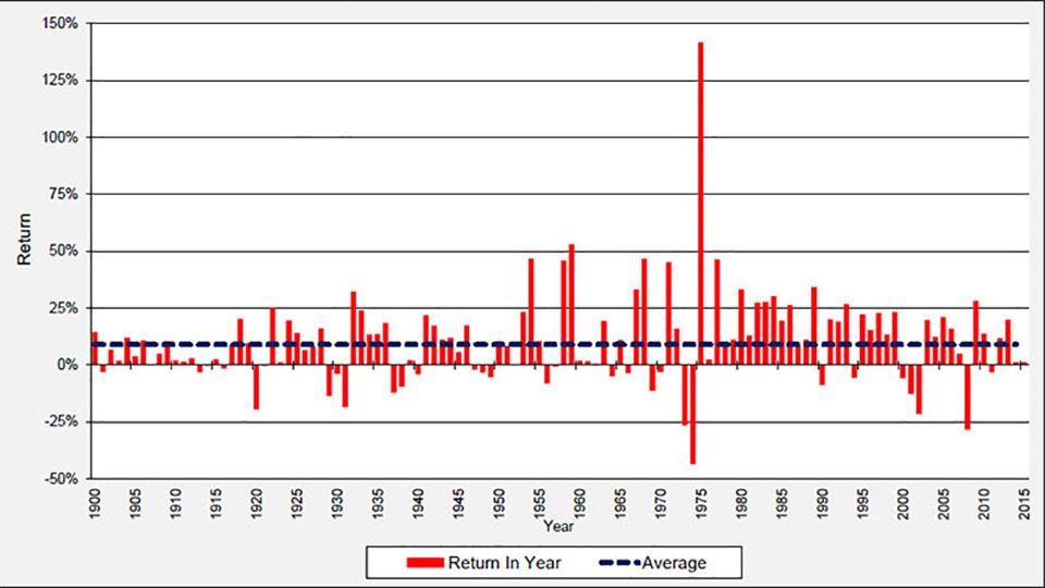
We now turn our attention to UK equities. Figure 3 shows how nominal equity returns have varied over time and Figure 4 shows the distribution of annual nominal returns on UK equities since 1900. Note that these returns include income, and as they are calculated on a nominal basis they do not account for inflation.
Figure 3: UK equity nominal returns since 1900
(source: Barclays / COURTIERS)
Figure 4: Distribution of UK equity nominal returns since 1900
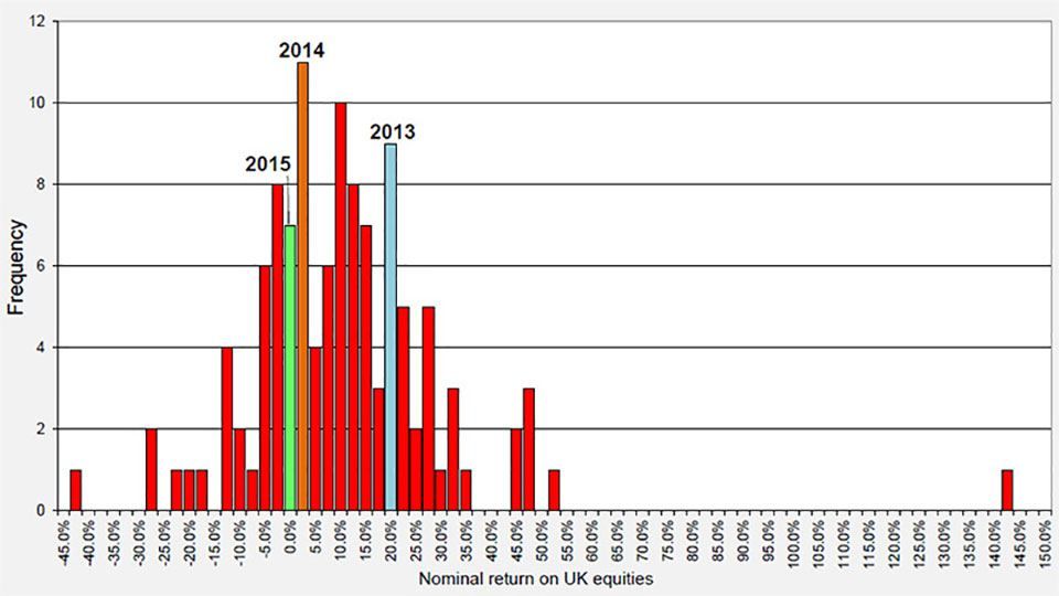
(source: Barclays / COURTIERS)
Figure 3 shows the massive impact which the seventies oil crisis had on equity returns. During 1973 and 1974 the annual returns were the lowest they had been since the start of the century but during the market recovery in 1975 UK equities returned a huge 141.8%. The 2008 financial crisis resulted in the second worst year for equities as they returned -28.3%.
Figure 4 shows that annual nominal equity returns roughly follow a normal distribution. The extreme outlier on the far right is the post-oil crisis return of 141.8% mentioned above. The highlighted columns show where the last three years rank in terms of historical equity returns. 2013 was an excellent year for UK equities as they surged by 20.0% but 2014 was mediocre as they returned 1.3%. 2015 was slightly worse still, as equities gained just 1.2%. The Study cites global market shockwaves, including the sudden devaluation of the Chinese yuan, as a reason for the poor performance of global equity markets last year. In particular UK equities were hit by the decline in commodity prices, with much of the performance drag being driven by exposure to oil and mining sectors, which declined 20% and 50% respectively.
The overall return of 1.2% makes 2015 the 83rd most profitable year for UK equities out of the last 116.
Gilts
Now we will examine the performance of UK government bonds, commonly referred to as gilts. Figure 5 shows annual gilt returns since 1900 and Figure 6 displays the distribution of these annual returns. Once again these are nominal returns and therefore don’t account for inflation, and note that the returns given include income.
Figure 5: UK gilt nominal returns since 1900
(source: Barclays / COURTIERS)
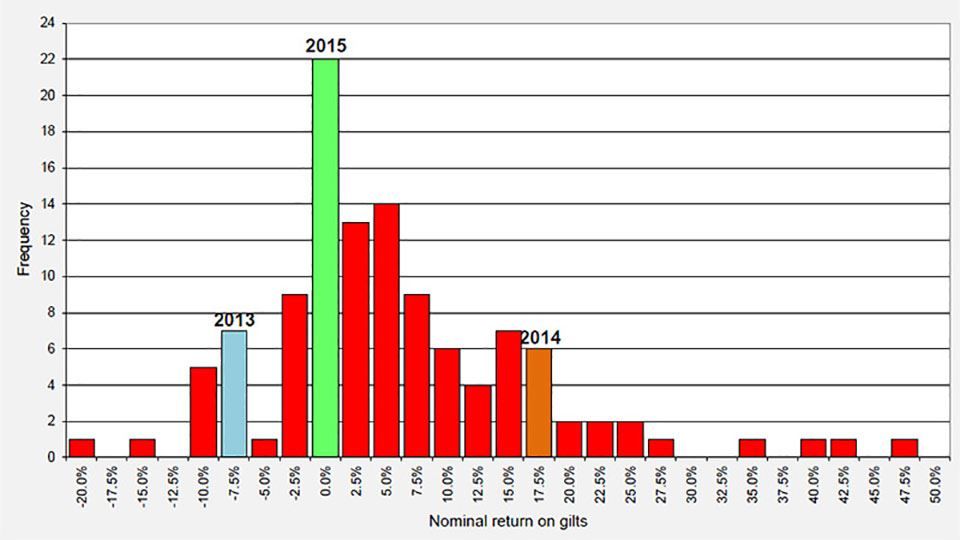
Figure 6: Distribution of UK gilt nominal returns since 1900
(source: Barclays / COURTIERS)
Figure 5 shows that gilt returns have mostly been positive, and reached as high as 47.3% in 1982. The worst annual return on gilts came during the First World War, when they returned -19.3% in 1916. Unlike equities, gilts didn’t suffer a big loss during the 2008 financial crisis.
The distribution in Figure 6 suggests that annual gilt returns follow a positively-skewed normal distribution, with positive outliers stretching further than negative outliers. This is supported by the fact that the mean return of 5.75% is greater than the median return of 3.65%.
Unlike equities, gilts performed poorly in 2013 and then surged in 2014. However, like equities, gilts endured a mediocre 2015 and returned -0.50% during the year. The Study puts this down to a market correction in the first half of the year following the strong gilt rally in 2014 which had been caused by investors pricing out rate hikes from the Monetary Policy Committee (MPC) and broader deflationary pressures. Overall 2015 was the 86th most profitable year for gilts out of the last 116.
Nominal vs. real returns
So far we have looked at nominal returns on equities and gilts. These do not consider the effect of inflation, which dramatically affects the real value of investments, particularly in the long term. The next two charts show the return on £100 invested in equities, gilts and cash (Treasury bonds) since 1900, on both a nominal and a real basis. Returns are reinvested annually.
Figure 7: UK nominal return on £100 since 1900
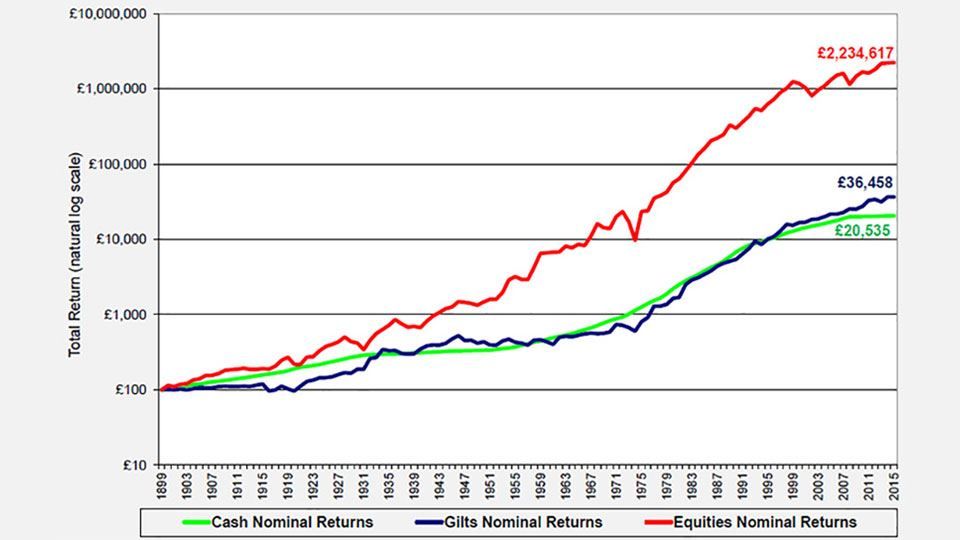
(source: Barclays / COURTIERS)
Figure 8: UK real return on £100 since 1900
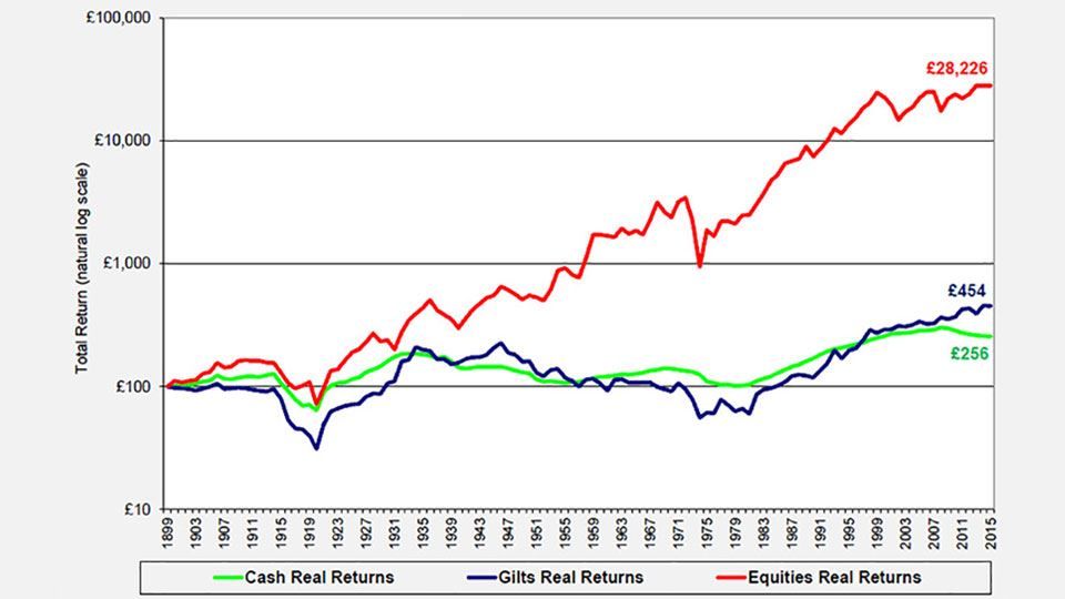
(source: Barclays / COURTIERS)
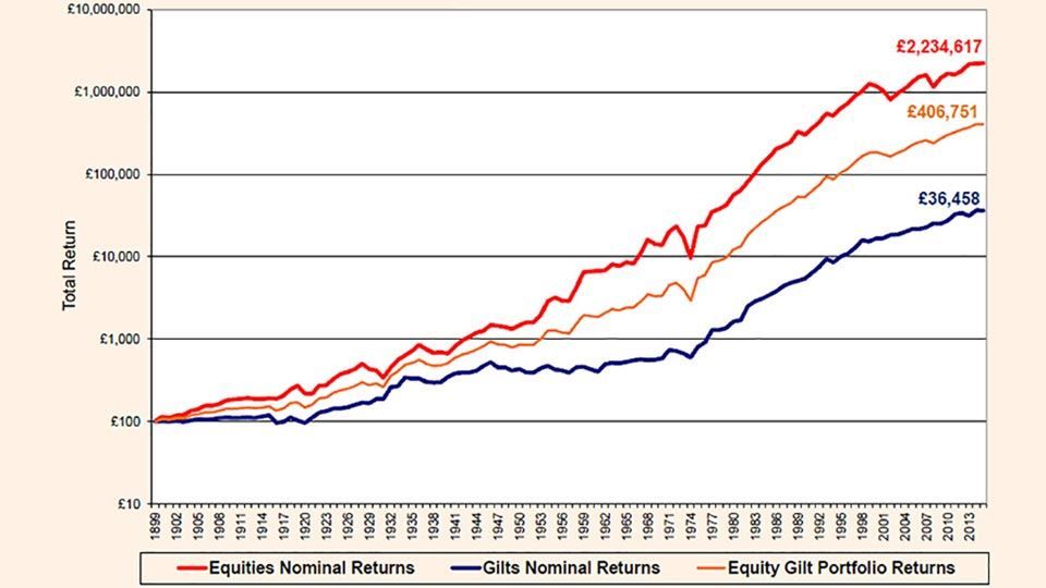
The charts demonstrate the huge impact which inflation has on long-term investments. £100 invested in UK equities in 1900 would now be worth £2.23 million on a nominal basis but only £28,226 on a real basis. Similarly £100 invested in UK gilts in 1900 would be worth £36,458 on a nominal basis and just £454 on a real basis. During the 1970s, the £100 invested in gilts back at the start of the century would actually be worth less than its starting value in real terms.
Volatility
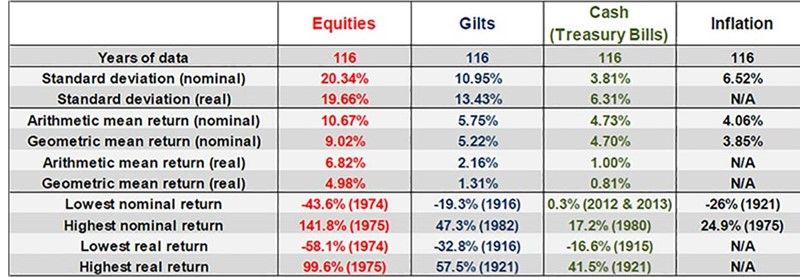
As well as returns we are also interested in the volatility of these returns. Figure 9 provides summary data on equities, gilts, cash and inflation, including standard deviation as the measure of volatility. Standard deviation is a measure of how ‘spread out’ the returns are, so a greater standard deviation in this instance means that the annual returns within an asset class are wider-spread.
Figure 9: Summary data for cash, gilts and equities from 1900 to 2015
(source: Barclays / COURTIERS)
The summary statistics show that the average return on equities on a nominal basis is almost double the average return on gilts, and on a real basis equity returns are three times that of gilt returns. However the volatility of returns is significantly higher for equities, particularly on a nominal basis. When looking at real returns, the difference in volatility between the asset classes is less pronounced. Figure 10 further illustrates the difference in volatility of nominal returns by providing rolling five year and twenty-five year standard deviations.
Figure 10: Rolling standard deviation of UK equity and gilt nominal returns
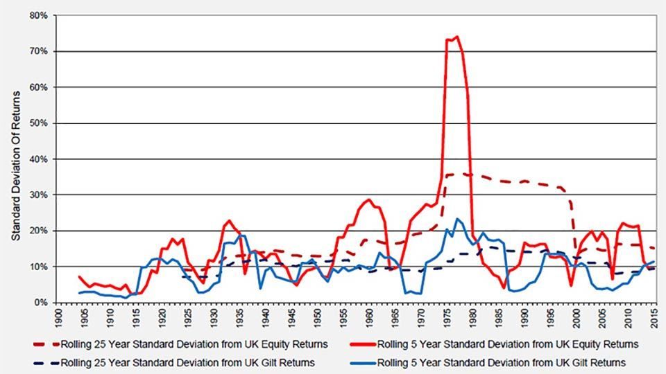
(source: Barclays / COURTIERS)
Both the rolling five year standard deviation and the rolling twenty-five year standard deviation are consistently higher for equities than gilts. There is a huge peak, particularly for equities, caused by the seventies oil crisis. During this period the all-time lowest annual return on equities of -43.6% was followed immediately by the all-time highest annual return of 141.8%, a swing which had a massive effect on volatility.
The chart above focuses on the standard deviation of annual nominal returns. However if we switch our focus to real returns and extend our analysis to multi-year annualised returns then we are able to observe an interesting result. Figure 11 shows the volatility of annualised real returns over several time horizons, starting from simple rolling one-year periods and increasing to rolling thirty-year periods.
Figure 11: Rolling standard deviation of UK equity and gilt nominal returns
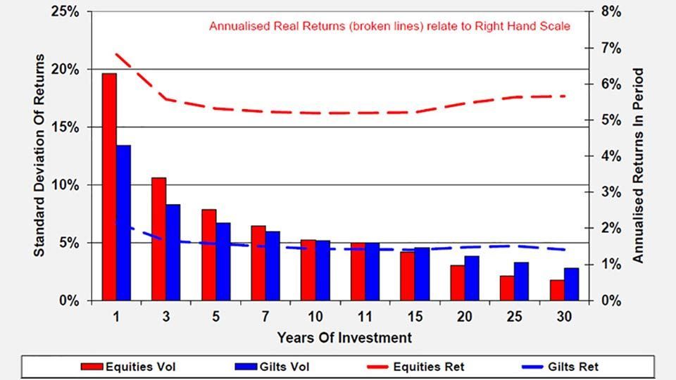
(source: Barclays / COURTIERS)
For one-year returns, the volatility of real equity returns is significantly higher than the volatility of real gilt returns. However as the time horizon increases, this difference starts to decline, and when the time horizon reaches eleven years, the volatility of real gilt returns begins to exceed the volatility of real equity returns. This suggests that when investing over a long time horizon, it is less risky to invest in equities than it is to invest in gilts. This result only holds for real returns and not nominal returns.
The Equity Gilt portfolio and risk-adjusted returns
Rather than investing in 100% equities or 100% gilts, it is more common to invest in a mixture of the two, since modern portfolio theory (MPT) states that diversification between asset classes will increase risk-adjusted returns. As part of our analysis we have designed the ‘equity gilt portfolio’ which consists of a 50% allocation to equities and a 50% allocation to gilts. Figure 12 shows how £100 invested in the equity gilt portfolio would have changed over time.
Figure 12: Nominal returns on £100 for equities, gilts and the equity gilt portfolio
(source: Barclays / COURTIERS)
As expected, the returns on the equity gilt portfolio fall consistently in between the returns on equities and the returns on gilts. £100 invested in the portfolio in 1900 would now be worth £406,751 on a nominal basis and £5,924 on a real basis, resulting in annualised returns of 7.42% and 3.48% respectively.
In order to examine risk-adjusted returns, we need to turn to the Sharpe ratio. The Sharpe ratio of an investment shows how many additional units of return can be obtained for one additional unit of risk. The expression for calculating the ratio is as follows:
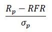
Where
Figure 13 shows the Sharpe ratios for equities, gilts and the ‘Equity Gilt Portfolio’, which consists of a 50% weighting in equities and a 50% weighting in gilts. They are based on real returns over a number of different time periods.
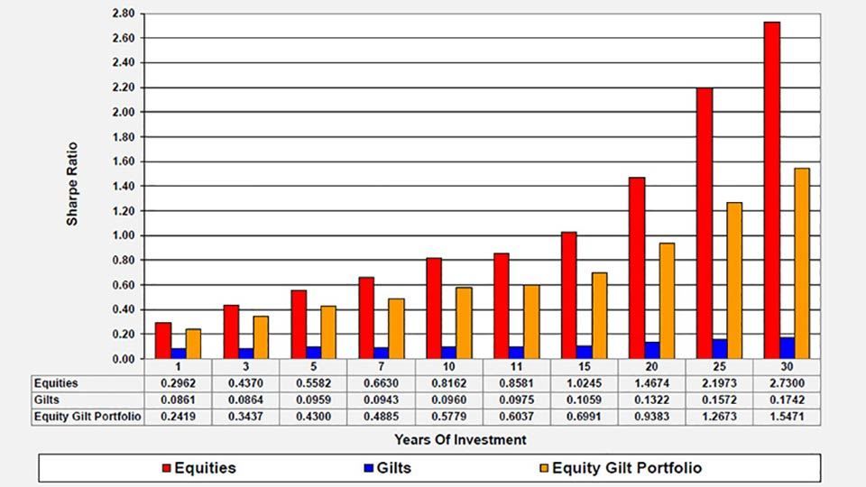
Figure 13: Sharpe ratios over various periods (using real returns)
(source: Barclays / COURTIERS)
Equities possess by far the greater Sharpe ratios at all time periods, and these Sharpe ratios rise as the time horizon increases. This is because, as Figure 11 showed, the volatility of returns goes down as the time horizon increases which means the denominator in the Sharpe calculation is getting smaller.
The Sharpe ratio for gilts is low for all time periods, but this is unsurprising given that the real return on gilts is usually very close to the pure risk-free rate, which means the numerator is close to zero.
Summary of real return analysis
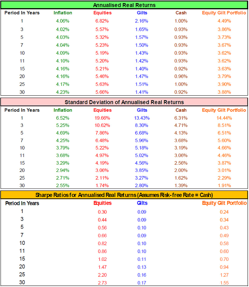
Figure 14 provides a summary of the return, standard deviation and Sharpe ratio results for equities, gilts and the equity gilt portfolio.
Figure 14: Summary of real returns, volatility and Sharpe ratios over various time horizons
(source: Barclays / COURTIERS)
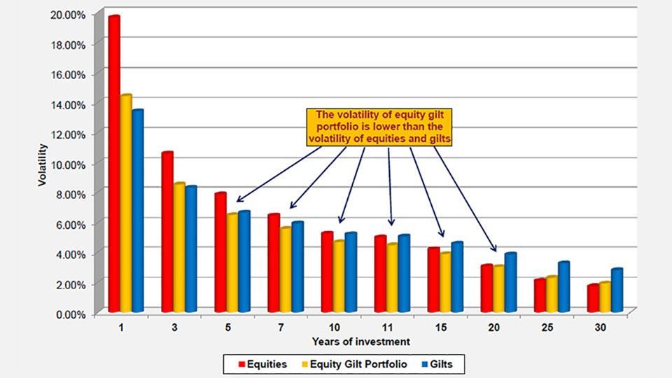
In some cases, particularly in the medium-term, the volatility of the equity gilt portfolio is lower than both that of equities and that of gilts. This is illustrated further in the following chart.
Figure 15: Volatility of equities, gilts and the equity gilt portfolio (using real returns)
(source: Barclays / COURTIERS)
The reason this happens is because when a portfolio contains two or more assets with less than perfect correlation, the overall risk of the portfolio is reduced. To see this, consider the following formula, which calculates the standard deviation of a two-asset portfolio:
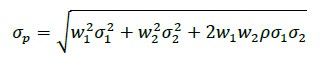
Where
If we assume a fixed 50/50 weighting, then the risk is minimized when the correlation between the two assets is perfectly negative, as the correlation coefficient, , p is -1 in the formula above. The risk is maximised if the correlation between the two assets is perfectly positive, and p is 1. The correlation between the real returns of equities and gilts over the last 116 years is 0.505, which is less than 1 and therefore a diversification benefit exists.