
The 2019 Seminar took place over three days from 11-13 December, with the first in Derby and the following two in Henley-on-Thames.
Topics Covered:
• Ups and downs in global markets throughout 2019 (James Timpson) – Jump to section
• A detailed look at two stocks in the Courtiers funds (Jacob Reynolds) – Jump to section
• Liquidity & Governance (Caroline Shaw) – Jump to section
• Is there a global debt bubble? (Gary Reynolds) – Jump to section
A summary of key content follows. If you have any questions regarding the summary or for anything else, please speak to your adviser.
2019 Market Review
Insight from James Timpson, Courtiers Analyst

What will 2019 be remembered for?
Theresa May resigned. Boris Johnson replaced her and, on the day of the final Courtiers Seminar, secured his position as Prime Minister with a 79 seat majority in the December 12 general election.
The trade war continued to have a big impact on global markets – many of the big swings in markets were the direct result of ongoing trade developments.
Huge protests arose in Hong Kong, triggered by a bill that would see criminal suspects extradited to mainland China. There’ve been over 4,000 arrests relating to these protests.
On a happier note, England won the Cricket World Cup for the first time ever in the summer. It was nice to see Ben Stokes punching the air for a change.
Wikilieaks Founder Julian Assange was finally arrested after seven years in the Ecuadorian Embassy in London. Prince Philip crashed his car, and that wasn’t even the worst thing to happen to the Royal Family in 2019.
Brexit dragged on as Britain didn’t leave the European Union on 29 March, nor did it on 31 October. Now it’s been pushed back to the end of January 2020. Let’s see what happens.
Before embarking on 2019, looking at the end of 2018, markets were in turmoil. The MSCI World Index collapsed posting a -7.4% return…one of the worst years since the Global Financial Crisis. The S&P 500 Index, which measures US Equities, had its worst December since the Great Depression in 1931. Christmas cheer in 2018 was in short supply where markets were concerned.
In the UK, despite a slump in August, the FTSE 100 Index, measuring the largest companies in the UK, posted a return of 9.2% – almost its exact average return over the last 20 years.
The FTSE 250 Index, which measures medium sized companies, gained 18.9% and on 11 October it rose a great 4.19%, its biggest one-day gain for over nine years.
Across Europe, despite a couple of blips the Eurostoxx index had a very good year… up 23.4% and just a couple of weeks before the seminars, it reached its highest level for over four years. Italian stocks had the best year, bringing in nearly 27%. The UK was the weakest market in Europe, largely due to uncertainty surrounding Brexit.
Emerging markets were volatile as usual. The trade war contributed to some big drops in May and August but overall returns were positive at 7.7%. Russian stocks were up nearly 35% for the year, although despite its geographical size, Russia only makes up 4% of the emerging markets index. The two biggest markets are China, which gained just under 12% and Korea, which only rose 2.3%.
Over in the US, the S&P 500 Index was up 25.3%, a record high. Analysing the index, we saw IT stocks had done the best, returning on average around 37.6% in 2019. Industrial stocks saw returns of 29%, while financial companies returned 27.5%. Returns among other sectors were fairly even, with the glaring exception of energy stocks which lost on average 1.8%, not helped by the volatility in oil price and the natural gas price.
In contrast to 2018, markets not only recovered in 2019, but returned a total of 24% up to the end of November 2019.
The pound, after reaching a 2019 high of $1.33 in March (prior to the general election when the pound soared), slumped to a low of less than $1.20 in September, the first time it’s done so since 1985 when Ronald Reagan’s tax cuts and increased government spending caused the value of the dollar to surge against the pound.
As a big gameshow fan, James rounded up his presentation with an end of decade special of ‘Play your Markets Right’, where returns are presented one after the other, and the audience are invited to suggest whether the next return will be higher, or lower.
Returns since the beginning of the decade
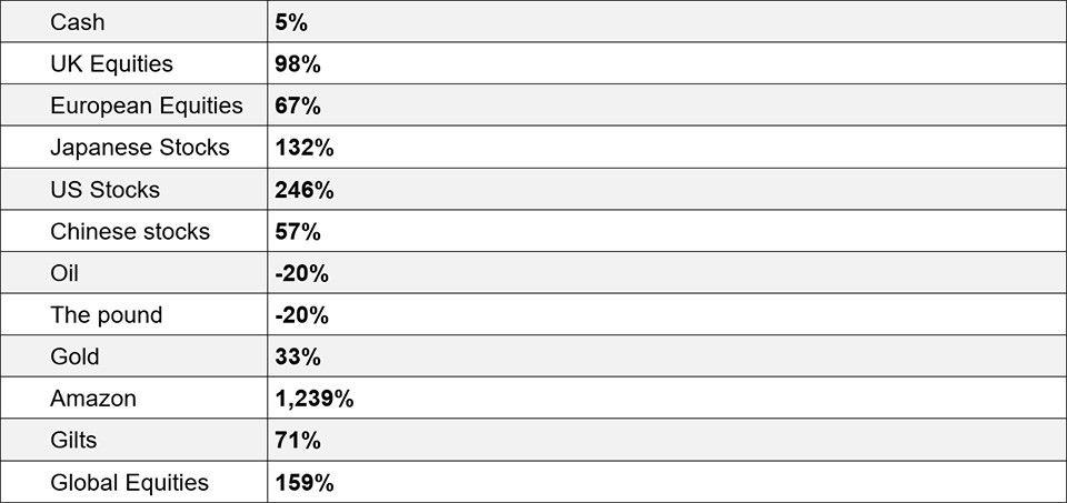
Source: Bloomberg. Past Performance is not a reliable indicator of future returns.
Despite some big wobbles in 2011, 2015 and of course the big one last year, equities have still provided superior returns to gilts and cash in the last 10 years.
Stock Stories
Insight from Jacob Reynolds, Courtiers Quantitative Analyst & Data Scientist

We are value investors. The godfather of this approach is a man called Benjamin Graham, who wrote Security Analysis in the 1930s and famously said “price is what you pay, but value is what you get.” Benjamin Graham’s most famous student was Warren Buffet, so we’re in pretty good company with this approach.
Under the spotlight, two companies in our portfolios this year highlight these principles:
- Bloomsbury: a UK publisher in our UK Equity exposure
- CSR: an Australian company in our Global Equity exposure.
So let’s shine on…
Bloomsbury
Many people may not be aware of Bloomsbury but will have read at least one of their books.
In the UK, the highest selling book of all time is the Da Vinci Code…and it’s not published by Bloomsbury. But Harry Potter is published by Bloomsbury and of the all-time top ten selling books in the UK, seven are Harry Potter.
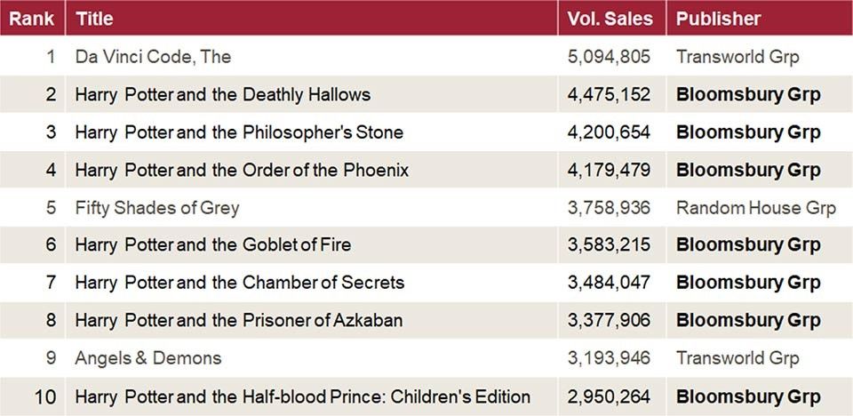
Source: Guardian / Nielsen Book
Harry Potter was not our cause for investing in Bloomsbury. Harry Potter was first published over 20 years ago, so why would it be on our radar today?
We invested in Bloomsbury because it landed very high on our shortlist. The price was good and while the market determines price, the market may have been seeing a one-trick pony in Harry Potter – a trick that was long in the tooth. Well we saw fantastic fundamentals: growing revenue, diversified earnings, strong management and a stable dividend.
What is our “shortlist” and how do we determine it? Courtiers has a data model, which sieves through thousands of stocks to identify characteristics consistent with value investing. Once a number of stocks are selected, they go onto a shortlist with best prices at the top and the list then goes to our analysts.
Our analysts work out exactly how the companies they’re researching generate revenue, making sure there are no cliff-edges for earnings in the process; for example a pharmaceutical company with a patent expiring in two years, or a new CEO changing a company’s direction.
Once they pass these hurdles amongst others, we will agree to invest.
Bloomsbury took the success of Harry Potter and diversified their earning streams among a number of bets, looking for the quality they seek in their authors. The 2018 best sellers showed this with Harry Potter at 21st, while Lose Weight for Good by Tom Kerridge sat up at number 4…also published by Bloomsbury.
What Bloomsbury do with their books is what we do with your investments. We know not every stock will be a Bloomsbury but if we can diversify and look for the characteristics and quality we seek in companies, we can try to create some stability of earnings and consistency in performance.
Since originally investing in Bloomsbury in 2017, following ongoing monitoring, research, analysis and essential agreement among the Investment Team, Courtiers has seen a return of 120% on Bloomsbury.
CSR
Established in 1885, the Colonial Sugar Refining Company is today an integrated homebuilder.
Australia is a really interesting case because they are currently experiencing the longest economic expansion in modern history, having passed the Netherlands two years ago. To put this in perspective, the last time Australia was in recession, East and West Germany were still separate countries.
CSR made our shortlist. Again, it ranked high with a very good price. We thought maybe the market was seeing a bubble in house prices and therefore didn’t want to invest in homebuilders. But one way to deal with a bubble in house prices is to simply build more houses and that’s the view we took.
CSR also ranked high on the model because of the underlying past generation and health of the business. CSR had a problem, having invested in a glass manufacturing company in 2007 before China entered the market. Within a year of investing in glass manufacturing CSR they had a perennial loss-maker on their hands. This suppressed their earnings even though other company assets were generating loads of cash.
After dropping the glass business in 2018, CSR rallied 77%. We didn’t get our timing perfect – all our advisers will tell you it’s a fool’s errand to time the markets, but since investing and divesting when it was no longer value stock, CSR has gone up 28.5%. Because we backed the model, reviewed it and topped up at the end of last year, we actually made closer to 40% on this position.

So with Christmas as a time for giving, here are some stocking fillers that could help you help your portfolios and help yourselves:
If you’ve found this small foray into value investing interesting, maybe you want to give the gift of The Snowball by Warren Buffet…published by Bloomsbury.
For those with a sweet tooth, unfortunately we don’t hold any sugar refiners anymore, but we do hold Tate & Lyle and they produce artificial sweetener. Maybe you can put a few of those in the stocking. Interestingly, the Tate & Lyle sugar and Lyle’s golden syrup you still see on the shelves, are no longer produced by Tate & Lyle. They walked away completely from sugar products in 2012, feeling that the world was heading in another direction.
Or finally, to show you the breadth of how your money is being invested, and maybe for the person who has everything – what about an industrial vat of vegetable oil, produced by our company in Thailand? I’ve personally asked for two of these.
I wish you all a Merry Christmas.
Courtiers Fund Performance, Liquidity and Governance
Insight from Caroline Shaw, Head of Fund and Asset Management.

Let’s look at returns for the Courtiers Funds and Courtiers Ethical portfolios for the year ending 30th November 2019:
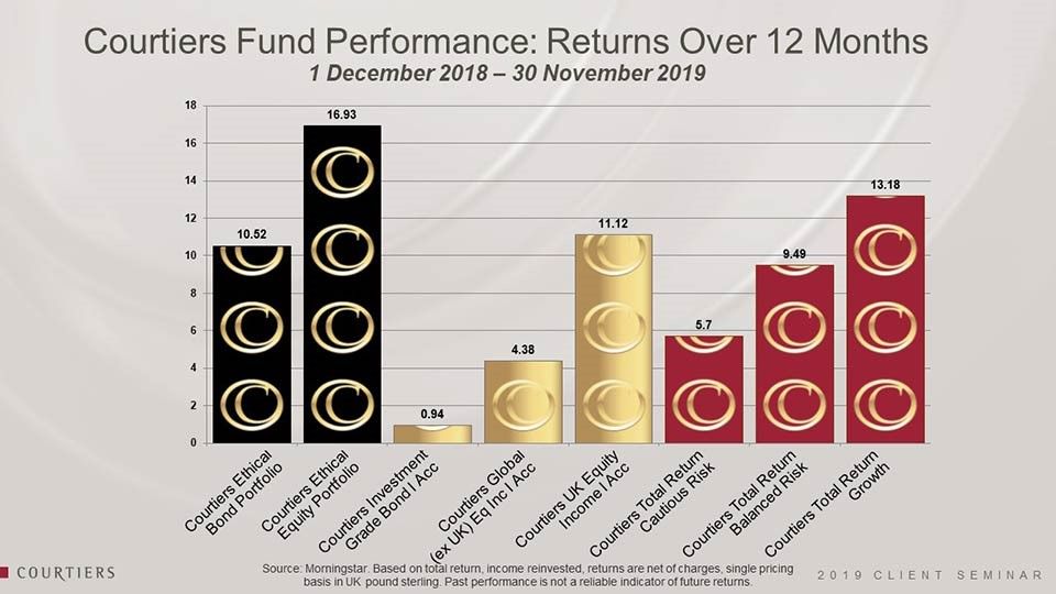
It’s been a really good year to be an ethical investor. Returns in our ethical bond were 10.5% and our ethical equity strategy, nearly 17%.
The Courtiers Investment Grade Bond fund returned about 1%, which is OK given where rates are – very low – and this invests wholly in government bonds.
Courtiers Global (ex-UK) Equity Income Fund, which includes the CSR stock Jake took us through, returned 4% so not too bad.
The Courtiers UK Equity Income fund returned over 11%. To put that into context, the FTSE 100 (total return including dividends) for the same time period is just over 10%, so we’re really pleased with this.
The Courtiers Multi-Asset funds – Cautious Risk, Balanced Risk and Growth – in which most of our clients are invested, returned 6%, 9.5% and just over 13% respectively. If I excluded a grim December 2018 from these figures we would have been looking at significantly higher returns across the board. So a really fantastic year in all for Courtiers investors.
Onto Liquidity
Liquidity is the ability to convert your assets into cash and use that cash. This is very important to you.
Illiquidity is the opposite. It is an inability to convert assets to cash.
On 13 September 2007, the BBC broke news that the bank Northern Rock needed Bank of England support. It was meant to reassure Northern Rock customers that things were OK because the Bank of England were going to help. But it didn’t reassure. 1.5 million investors withdrew £12.2 billion. The next day 72 branches of Northern Rock opened with massive queues outside…all people wanting their money out.
Regulators tightened up after the Northern Rock crisis and a result, protection for investors from the Financial Services Compensation Scheme increased from £2,000 to cover £85,000…a great result for investors.
We all know some assets are illiquid. Anything you may (or may not) be able to sell at an auction for example, is illiquid. It may not sell. It may not reach the price you wanted. The auctions aren’t very frequent.
The other thing that’s much closer to home for all of you, that you know is illiquid, is your own property.
Courtiers doesn’t invest in illiquid properties, residential properties, sculptures or pieces of art in your portfolios.
So how do we measure liquidity? We look at how easy it is to trade what we are invested in.
Take a look at these FTSE 100 companies, some of the largest companies listed on the main market in the UK:
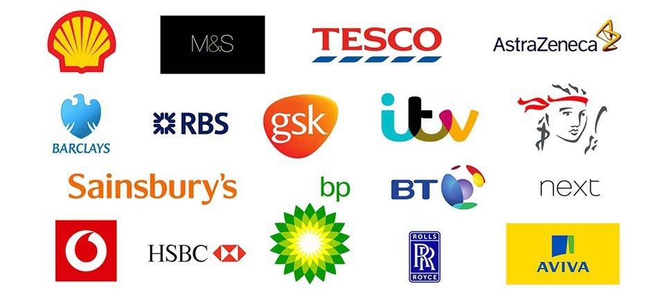
All these companies trade more than £20m worth of shares per day, so it’s no problem for us to be able to trade those companies. It takes seconds to place a deal in these companies and get it executed in the market. So we’d describe these as liquid – plenty of liquidity.
Here are a few more household names, a little further down the ladder:

These are at the bottom end of the FTSE Small Cap, much smaller in size than those in the FTSE 100. These trade typically, on average, £0.5m worth of shares a day, so it’s much harder to trade those shares if you have a big position in them. Trading shares in these can take longer than a few minutes, sometimes a day or two, so they are a little less liquid.

Moving onto the Alternative Investment Market (AIM), there is mixed liquidity. The drinks company Fever-Tree is pretty liquid, trading on average £11m worth of shares a day. But Hotel Chocolat and Joules are much less liquid with only £200,000 worth of shares a day traded. If you have an investment in those, it might be very difficult to get rid of it.
The “Alternative” Investment Market is a little bit more lenient on the reporting requirements than the main markets. Companies listed get an extra two months to produce their report and accounts, they don’t have to produce any interim management statements, so as an investor there’s less transparency, meaning more potential risk and also sometimes illiquidity.
Below AIM is the unquoted market, featuring the private companies, or “unlisted” companies as they’re called.
Private companies are owned by private individuals and shares in these are very difficult to sell. You literally do have to find another shareholder to buy them and many people aren’t familiar with who else owns shares in the private company.
So private, or “unlisted” companies aren’t liquid at all and to clarify, we have no positions in private or unlisted, unquoted companies. In fact, we haven’t got any investments in the alternative market either.
Liquidity issues over the last 25 years
Here are some cases where investors were unable to access their money.
Firstly, the 1996 Morgan Grenfell Asset Management case, where fraud and poor oversight were combined with large numbers of unlisted investments. In this case, the parent company, Deutsche Bank, responded effectively and acted immediately to buy the unlisted companies out of the portfolios so it could reopen them. It compensated 180,000 investors. This cost Deutsche Bank £400m and an additional £2m in fines.
The second example is the 2009 case of Arch Cru, involving a £400m series of funds that were marketed as low risk. However, the funds invested in forestry, fine wine, Greek shipping and student accommodation. I think you’ll all agree none of those are low risk and they’re all pretty illiquid.
Investors saw pretty good returns for a while, but in March 2009 people wanted their returns and their money out. Arch Cru couldn’t sell those assets quickly enough to give people their money back and the fund suspended.
Fines were meted out to several counterparties, with many found culpable of insufficient due diligence and oversight. A settlement scheme was set up and it has slowly paid compensation to investors. 10 years on, it is still paying out. A long time and still not resolved.
The third example involves illiquid assets (bridging loans), fraud and poor oversight. It again resulted in fines for those guilty of not conducting appropriate oversight. The Connaught Guaranteed Low Risk Income fund turned out to be neither guaranteed nor low risk.
The final discussion on illiquid assets concerned the downfall of Woodford Investment Management, with investors still unable to access their money. This is a good example of investing in unlisted companies with insufficient oversight. This one is going to run into next year – at least next year. I wouldn’t expect the news flow for this to stop for quite some time.
Mini-Bonds
Six years ago I talked about mini-bonds. I had a letter through the door offering me a mini-bond paying around 8% from a company that had made beds – the beds I’d bought for my children.
Then they were offering me a bond paying 8% but I warned you all in 2013 to be really careful with these mini-bonds because they aren’t regulated by the FCA. They are not transparent and you don’t really know what’s in them. They don’t produce reports and accounts and they are unquoted. You cannot trade them – your money is locked in.
Interestingly, the company that was going to sell me that bond has since gone bust.
There have been mini-bonds in the headlines again this year. London Capital and Finance has lost £237m with 14,000 bond-holders affected. It promised 11% on its bonds. When rates are at 0.5% or 0.25% and somebody promises you 11%, you’ve got to start asking questions about risk. This mini-bond has gone into administration and investors may get back 20 pence for every pound they’ve put in.
Asset Life also went into administration this year too, as did Harewood. Blackmore hasn’t gone into administration yet, but it has missed two bond payments: one in July and one last month. So the writing is on the wall for that too.
So mini-bonds have not been a good place to be and two weeks ago the regulator announced a ban on the marketing of mini-bonds for 12 months from 1st January, while it consults on some permanent rules. That’s a good thing – possibly a bit late but they are at least taking action.
Property Funds
Property funds obviously invest in something that’s illiquid.
The regulator recently reviewed property funds. You may remember in 2016, after the Brexit referendum vote, some property funds suspended, including the M&G Property fund, which at the time was £4.5bn.
You may have seen in the news two weeks ago that the M&G Property fund was suspended again. This time it was £2.5bn in size.
The FCA brought new rules in September. At the time I put a piece onto our website suggesting the rules might result in more suspensions and higher weightings to cash. It happened quicker than I thought. I think this new regulation will mean the death of open-ended property funds. Property held in an open-ended fund is a really dangerous thing from a liquidity perspective…there are better ways to get your property exposure.
Bridges
Many of you will know I like a bridge and new to your portfolios this year is the Muiderberg Bridge in the Netherlands. It is the longest railway bridge in the Netherlands and won a steel prize in 2018.
If you’re invested in the Multi-Asset funds: Cautious, Balanced or Growth, this is in your portfolios as part of this overall infrastructure exposure, which has contributed 13% to portfolio returns this year. So it’s been a really good diversifier and a good contributor.
Of course, a bridge is not liquid. You can’t just sell a bridge overnight or even in a few minutes like we can other things, but we don’t invest in our infrastructure through an open-ended fund. We do it through a closed-ended fund.
Open-ended vs closed-ended
If you invest in an open-ended product, when you put your money in, the fund size swells bigger and the fund manager will buy more assets with that money.
When you want your money out of an open-ended product, the fund manager has to sell something to shrink the fund down to pay your money out. That’s the problem with these property funds. When you put money in, the fund manager buys a property. When you want your money out, the property needs selling.
For the infrastructure exposure we have in your portfolios, we own it through a closed-ended fund. A closed-ended fund has a fixed amount of shares that won’t change. When I put my money in, I have to buy off somebody else already invested in the fund, a bit like shares in Vodafone. If you want to buy a share in Vodafone you actually have to find a seller, then your stockbroker will match you to that seller.
If we wanted the money out of the infrastructure product, if Courtiers chose to sell it, we would find a buyer and sell it to them. The people running the infrastructure product wouldn’t have to sell that bridge for me to get money out, so we have a great deal of comfort because we’re investing in the appropriate legal structure for these kinds of assets.
All in all
We’ve covered liquidity and governance. The connection between all four examples is the lack of oversight and governance.
There are regulators. It’s important to have strong regulation and important to have a strong depository. Citigroup oversees Courtiers funds.
It’s also important to have strong auditors and people who ask questions. Internal and external oversight committees ask us questions all the time to understand exactly what Courtiers is doing.
Is there a Global Debt Balloon?
Insight from Gary Reynolds, Courtiers Chief Investment Officer.

We’re going to cover debt. I’m going to talk about whether monetary policy’s failed and then we’re going to have a little look at risks and see which assets are possibly the ones to watch out for and avoid over the next few years.
Global Debt
The headlines are screaming:
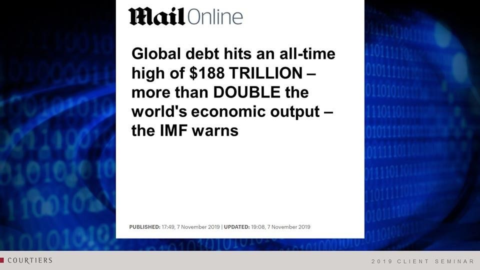
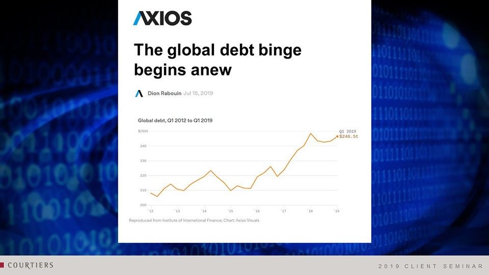
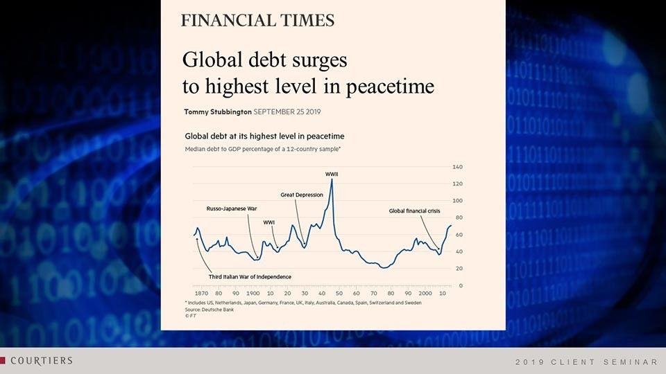
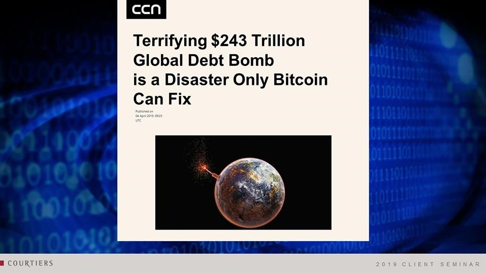
Should you be concerned about this level of debt? Well let’s have a look at the details here:
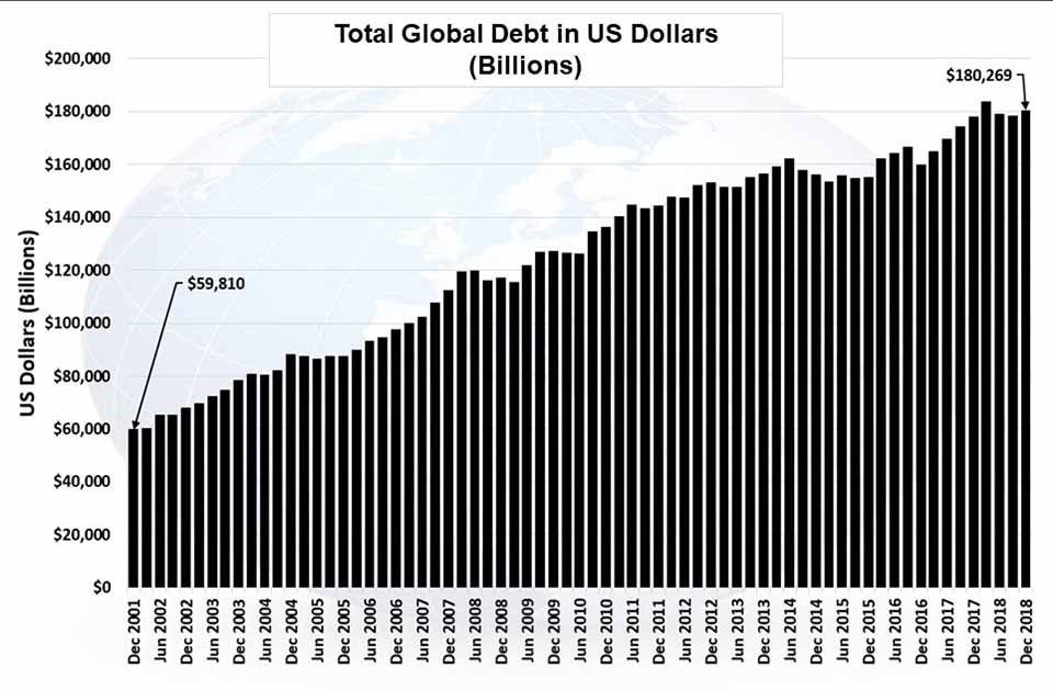
Source: BIS
These are the figures causing this type of quite sensational headline. In 2001, total debt in the world was about $60tn. Put in context: total output around the world today is somewhere around $85tn. Today, that debt figure’s gone to $180tn, so we’ve had a 200% increase in that period.
As an annual increase it’s about 6.3%. As the world economy has grown nominally by slightly less than that over the period, it means there has been an increase in debt in both nominal and percentage terms.
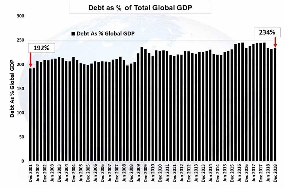
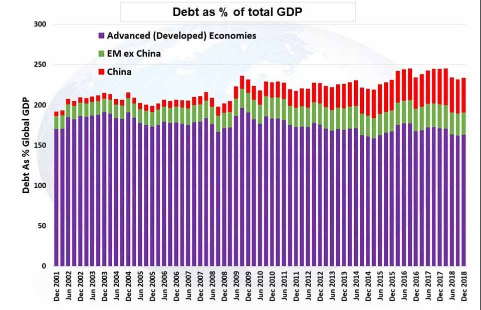
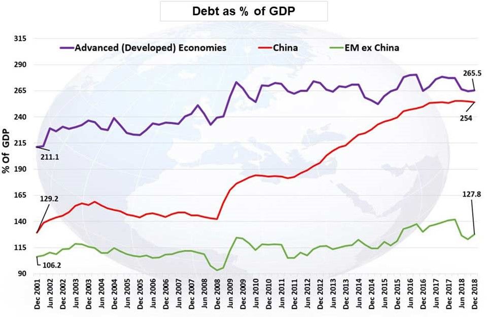
Debt back in 2001 was 192% GDP. Today it’s 234%:
Source: BIS
Now in the Investment Team, we say don’t take the headline figures. Always dig in below and you’ll find interesting information:
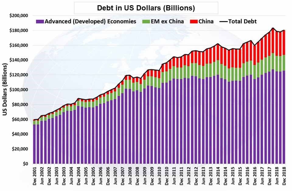
Source: BIS
The purple bars represent the developed economies of the world: UK, US, France, Germany, Japan. This is their level of debt in billions of dollars.
The green bars are emerging economies around the world excluding China. China we stripped out completely and you see it in red. When you do this you see this incredible increase in the amount of debt the Chinese have and it’s been ballooning. It’s also been ballooning as a percentage of total GDP:
Source: BIS
Total debt in the advanced economies as a percentage of total global GDP has remained fairly stable but for China, they form an increasingly bigger percentage of total debt as a percentage of GDP.
Now, debt itself is not such a bad thing. You will not get economic growth without debt. If we wanted to make tyres somewhere in Henley, we’d need to have a factory, machines – we’d need to buy the raw materials and we would need a startup finance to do that. We would either raise it through equity, borrow some money or do both. We can’t kick that factory off unless somebody buys the premises, buys the machines, and doing so will create debt. Debt in this sense doesn’t necessarily mean just borrowing. It also means equity – money that’s given to a company in the form of ownership.
The next chart shows you that as GDP goes up, debt goes up. Or if you like, as debt goes up, GDP goes up. There is a very clear relationship:
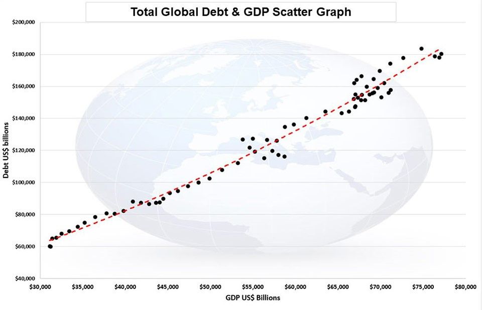
Source: BIS/ Courtiers
Dotted in red is a trend line. This is a polynomial trend line, which means it can bend both ways depending on what’s happening. Here it’s beginning to curve up to the top right, which is to be expected, because as GDP grows, to get another unit of GDP you need more debt than you did to get the last unit.
Irving Fisher, who was an economist in the late 1800s / early 1900s talked about two types of debts: productive debt and unproductive debt. Productive debt is debt that buys an asset, which pays an interest and which enables you to service the debt and pay it back when due. Unproductive debt is debt that goes into an asset that doesn’t generate enough income to pay the interest or enough capital to pay it back when it becomes due.
The biggest productive debt many make in their lives is probably buying a house, which provides an income because it saves paying rent, and it gives a return because the average price of houses has risen quite strongly over the last few years.
Now let’s look at China with the same type of chart. The curve is much steeper up to the top right:
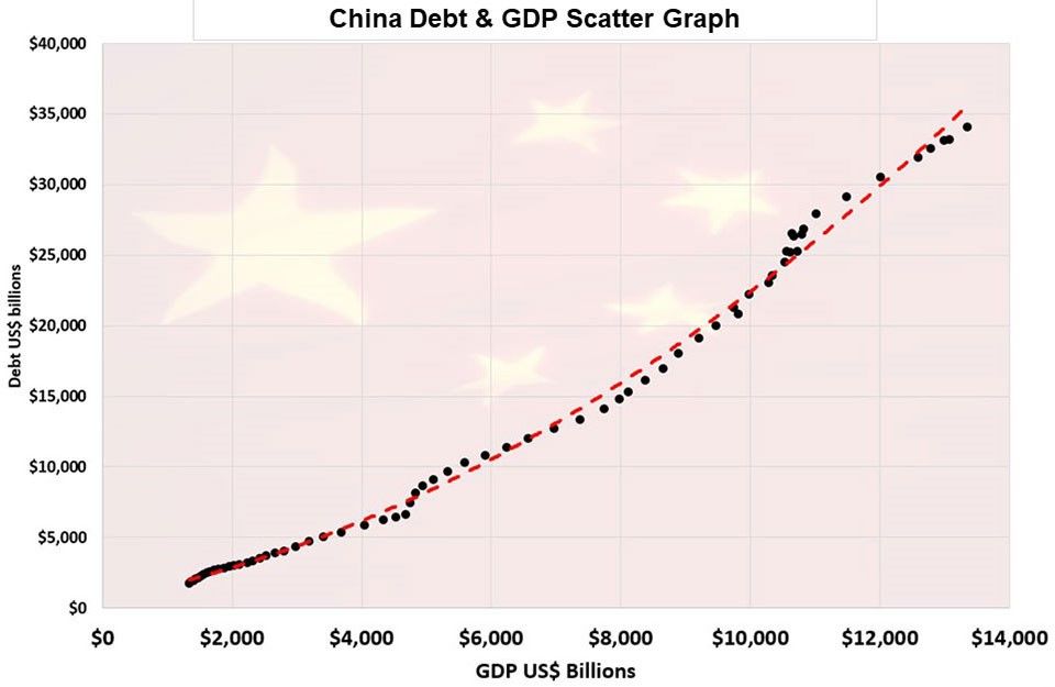
Source: BIS/ Courtiers
China, in its eagerness to catch up in terms of the world economy, has been taking on more and more debt, but perhaps it’s not been as productive as the debt taken on by other countries.
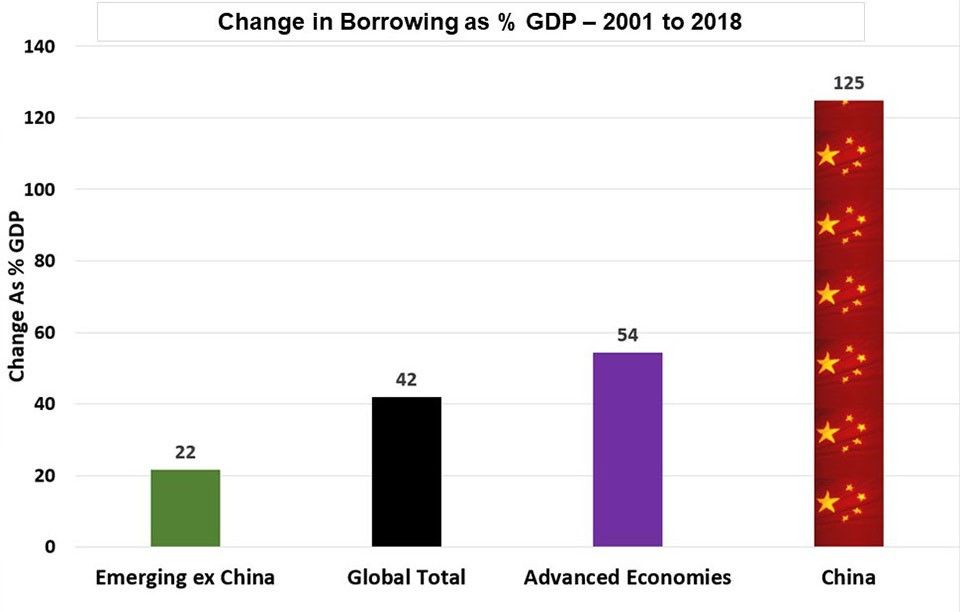
Over the last 17 years to the end of last year, China has taken on another 125% debt to GDP.
Source: BIS/ Courtiers
Source: BIS/ Courtiers
China’s been borrowing a lot, which was no bad thing post the financial crisis. They were about the only economy in the world actually fighting against the forces of depression following the collapse of the financial system. They did it with some force, but also the Communist Party at the time were very keen to generate an economic growth rate of around 10% per annum. That’s come back now, they claim it’s around 6%. More likely it’s around 3-4% so it’s slowing down.
To put this in context further, interestingly China’s debt to GDP ratio has now gone above that of the US:
Source: BIS
The cost of servicing debt has dropped in the UK and US, and it’s very low in Germany but in China it’s gone up:
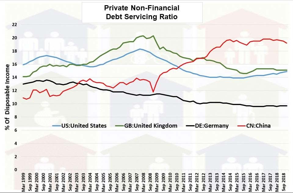
Source: BIS
Has this had a positive impact for the Chinese? Yes, it has had a degree of positive impact. In fact the Chinese economic recovery is something of a miracle.
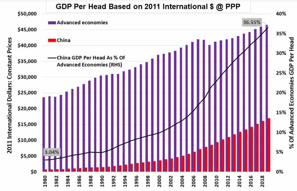
If you track back here, this black line is telling you the percentage output per head of every man, woman and child in China. In 1980 China’s output per head was just 3% of the advanced economies. Six years before that in 1974, where Deng Xiaoping went over to the United Nations for the first time, he needed to raise money to take the delegation out. Pay for flights, pay for hotels etc. They had to scour the banks of Beijing to raise $32,000. That wouldn’t be too much of a problem for the Chinese now and this shows how far they have come in a very short period. But they’ve not come that far relative to the productive capacity of the rest of the world and particularly the Americans.
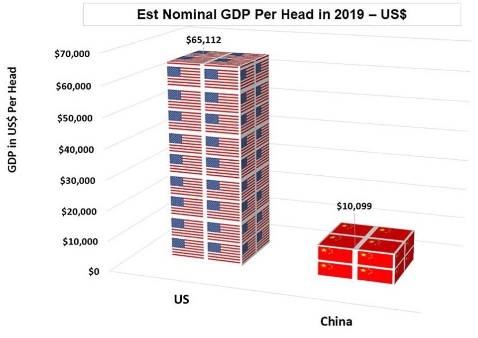
Source: IMF
This chart gives you output per head for the average American compared to the average person in China. In China, the average output per head is just under $11,000. In America it’s $65,000. So China’s output per head one sixth of the US, even though China’s debt to GDP ratio has already gone through that of the States.
Now, whatever anybody says, America is a phenomemon. There’s a lot of argument at the moment as to whether America is slipping as the global hegemony. When you look at the figures for military spending, you can see that this is not happening:

Source: The World Bank
It’s a huge, huge amount of military spending. In fact, America spends more as percentage of GDP on its military than does the Chinese. Russia spends more, but Russia in terms of total, spends less than the French, which is quite surprising for lots of people.
So we’ve had a big increase in debt. When you dig below the figures it’s actually not that bad except in China where it’s become quite excessive.
Too much borrowing or too much saving?
Debt is like anything else. It clears through the market. You have borrowers and savers and they match everywhere – exactly, because savings can’t exist in a vacuum. If you put money into a building society it must go somewhere, otherwise interest can’t be paid to you. The test is if there’s lots more saving, it tends to drive down interest rates. This next chart shows the rate of saving has been going up:
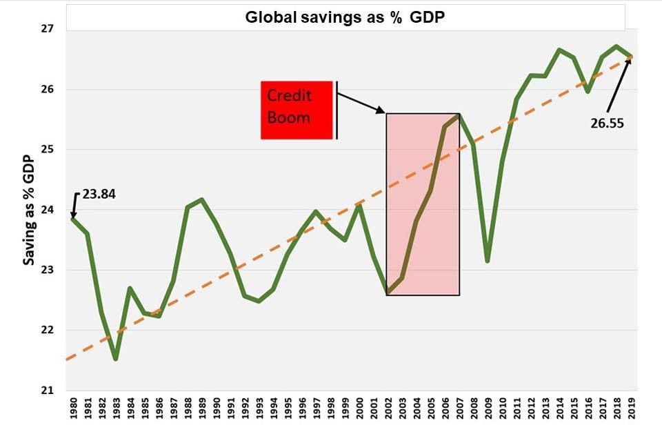
Source: IMF (International Monetary Fund)
You can see the rate of saving was shooting up during the credit boom. For all the criticisms the banks had in the period leading up to the credit crisis, you could argue that they were doing their job. Intermediating. The world saved more and those savings needed to get loaned out somewhere and they did.
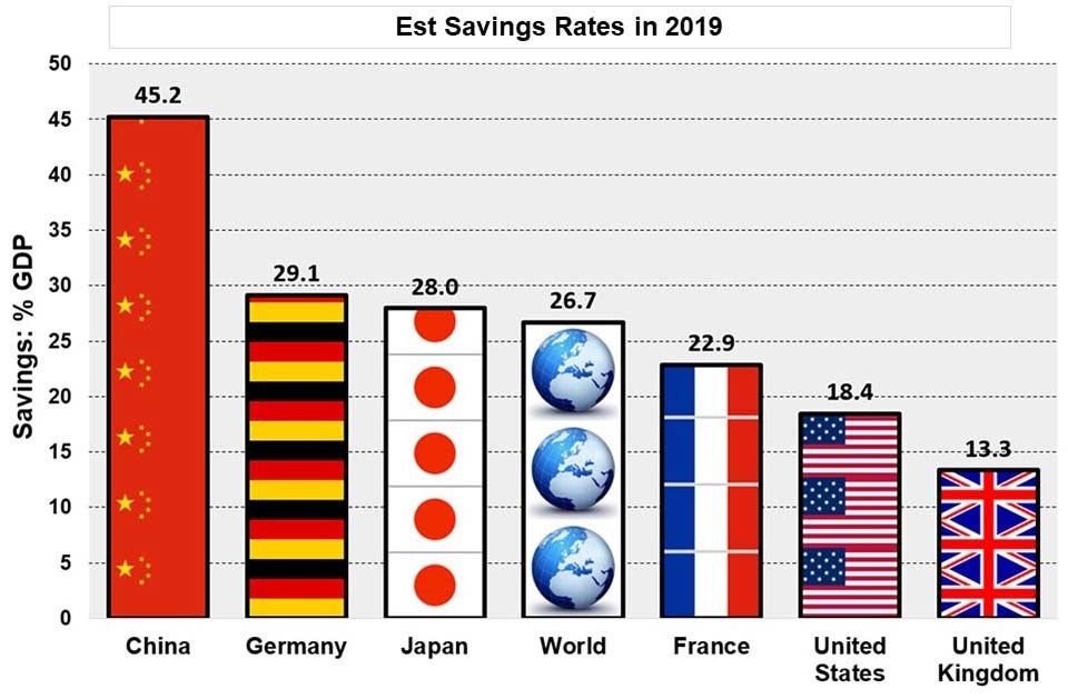
Source: IMF (International Monetary Fund)
China still saves 45% of it’s GDP. Germany has an immense scope to spend more but it’s constrained by the fact that it’s precluded from running a government deficit. It saves 29%, Japan 28%. There’s the global average, just under 27%. In the UK we’re very good, because we don’t save very much, we spend and someone’s got to create the demand. If you don’t create demand, jobs won’t happen around the world or at home. So, there’s been too much saving, and too little spending.
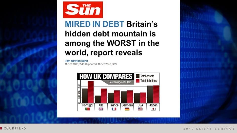
Now, coming back to the UK and the headlines. Was The Sun right when it said that we as a nation are mired in debt?
It was right in one sense. It has been going up:
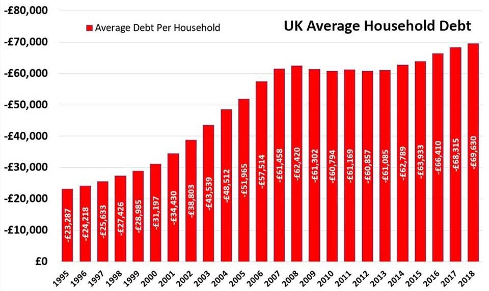
Source: ONS
Back in 1995 the average family had borrowings of just over £23,000. Come 2018 it was just under £70,000. That’s a pretty significant increase, particularly at a time when our rate of ecomonic growth hasn’t been great and inflation’s been under control. But there are two sides to the story. When you borrowed your mortgage you bought a house, so you had a debt and an asset. There are two sides to the balance sheet. If we take the other side of the balance sheet into account and you look at assets:
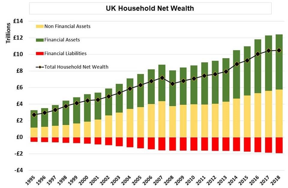
Source: ONS
The green bars are financial assets: stocks, shares, your building society deposit we were talking about. The yellow bars are real assets: land, property, mainly housing. The red bars are the borrowing. The net value of household wealth has been rising quite strongly. Households in this country, on a net basis, are much better off than they’ve ever been.
Now I said, you should ignore nominal figures and always relate assets and debt back to income. We’ve done it here:
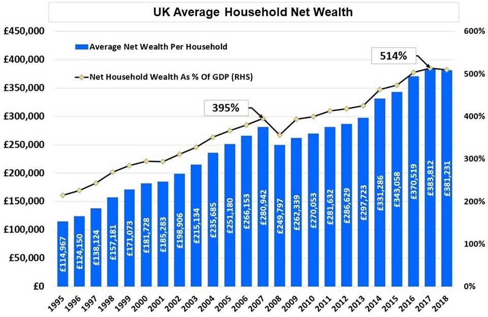
Source: ONS
The black line shows you total net household wealth as a percentage of GDP. We know 2018 wasn’t a great year, and asset values actually dropped a little but not by much. In the previous year, total household wealth went through 500% of GDP in this country. That’s huge. It also tells you that there’s an awful lot of money around that could be taxed and could be spent. If people were prepared to forego the rate of increase we’ve had in household wealth over these last four years leading up to 2017, we could pay off the national debt. You have to be a bit careful, because the Venetians did this a few years back with a thing called a Prestiti Bond, when every family in the city was forced to invest in these bonds, and the money was used to pay off Venice’s debt. They did pay a bit of an interest but there was no guaranteed payback date. They were infinite – a bit like the old war loan in the UK that we used to pay off the debts in WW2.
The UK is in rude health. There’s not too much debt. You’ve got to watch China where arguably it’s not being spent that cleverly.
Monetarism vs Fiscalism
This is the real issue that’s going to affect investors in the next few years. We’re going through a sea change – a seminal moment.
These two gentlemen are at opposite ends of the argument:
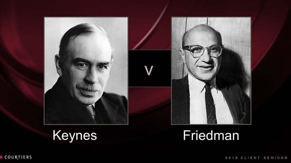
On the left, John Maynard Keynes (1883 – 1946). Keynes wrote the Economic Consequences of the Peace in 1919. His argument was that the peace treaty signed with Germany would drive down the German economy to such an extent that it would be a disaster for Europe. Keynes also argued that while supply and demand do eventually meet through adjustment of prices, he said they sometimes get sticky. They don’t always adjust. We can’t always match unemployed workers with the new jobs fast enough. Sometimes the government’s got to intervene and boost spending.
Keynes’s policies ended the depression that happened in the late 20s – 30s. It was the blueprint for governments around the world from that point onwards. The problem is, that governments couldn’t stop spending even when there was good demand in the economy. As a result, us and the US ran into the 70s with massive inflation and Keynesianism was blamed for that outcome.
Along comes Friedman. Friedman wrote a book which was about money and interest rates, and Friedman made his very famous statement, “inflation is always and everywhere a monetary phenomenon”. In other words, control the money supply, control the price of money and you will control inflation.
So, based on Friedmanite views, Regan comes into power in the 80s, Volcker becomes Chair of the Federal Reserve and they did a terrific job (Volcker died last Sunday actually aged 92). Inflation was driven out of the system. Thatcher followed a lot of Friedmanite thinking and Keynes was finished. Nobody wanted to talk about being Keynesian any more and that was generally the blueprint that was then used in the world.
Now, you can see what this monetarism did when you look at long-term interest rates. There are fantastic resources on the Bank of England website, which gives you a millennium of data. You can check things in the UK back to the time of the doomsday book, 1080s. So it’s really quite interesting.
Source: Bank of England, Bloomberg & Courtiers – Past performance is not a reliable indicator of future returns.
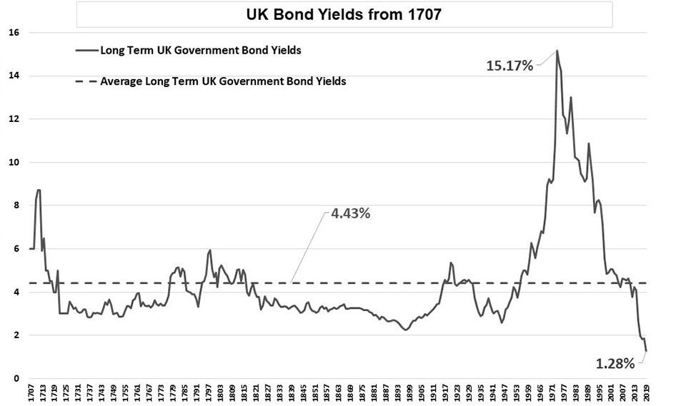
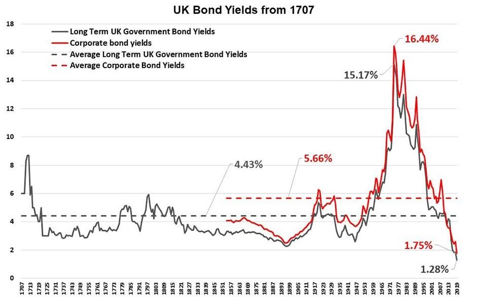
Here I took long term interest rates going back to the start of the House of Hanover, so we’re just coming in when George 1st comes into power. We’re looking at this over just about 300 years. These are UK bond yields, courtesy of the Bank of England and they’re long dated bonds.
As you can see, the rate goes around a little bit but the long-term average is 4.43%. Then the 70s see the start of monetarism. Interest rates driven up, the demand for money killed – inflation brought under control. And we go on doing it. Politicians very often get set in one way and it works and they go on doing it, and doing it and doing it. And so it’s gone on.
The data gets updated every two or three years by the bank of England. I’ve had to stitch on 30 year gilt yields to get the data up to 2019. 1.28%, at least before yesterday’s election, was what you would get paid by the UK government for lending them money for 30 years.
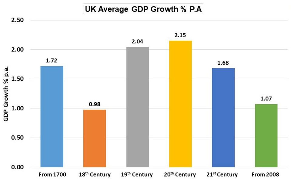
Monetarism is just not working and you can see post 2008, the average GDP growth rate has been 1.07%.
Source: BoE Millenium of Data
There’s no recession in this period. All the other centuries have got their own recessions and the 1700s was a terrible time, but generally we’ve been able to get better economic growth than that, and productivity, which you need to give people real increases in wages.
Source: BoE Millenium of Data
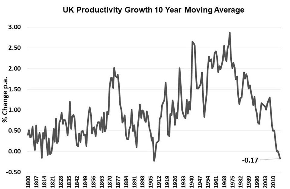
Average productivity improvement in the last ten years, -0.17%. You can see the productivity trend going down.
There’s a lot of talk about monetarism now and this is absolutely key. If you get nothing else from what I’ve said today, then just take this out: a change is coming.
Investments to be wary of
Under a government that becomes more sympathetic towards fiscal policy – in other words if they want to spend more and they’ve told you they’re not going to tax you any more, funds will come from borrowing and they’ll hope to get GDP increases which means they’ll keep the rate of borrowing to GDP consistent.
If the rate on 30 year gilts goes back to the long term average of 4.43%, the holder of that gilt will lose 52% of its value in a shot. It’s not a safe investment and that’s why we’re very nervous about bonds.
Source: Bank Of England, Bloomberg & Courtiers. Past performance is not a reliable indicator of future returns.
Conclusions
• Bonds could be the worst investment of the next decade
• Real assets perform better in periods of higher fiscal spending
• Stay diversified.
Q&A Panel
Before a light lunch we closed this year’s seminars with a Q&A panel, inviting all presenters back onto the stage.
Questions were submitted throughout the seminar and while we put a few to the panel, of course we have more than time allowed.
We’re in the process of collating answers, the majority from the Investment Team. We’ll follow up early in the New Year with a piece covering all questions – those taken by the panel during the seminar and those submitted by guests which we didn’t get time to answer on the day.
That’s a wrap!
Thank you to our clients and guests for attending the seminars and for some fantastic all-round feedback afterwards, which we always appreciate.
Thank you to all our presenters for such informative presentations.
Thank you to our host and supporting teams for ensuring a comfortable and smooth running event.
From everyone at Courtiers, have a very Merry Christmas, a Happy New Year and we look forward to seeing you throughout 2020.